Building Polestar’s Digital Experience: How we Engineered a 3X Increase in Conversion
By Shanky Munoth, Engineering Manager, YMLEvery consumer brand wants to crack the same code — create a digital experience that drives value for the user, and their business too.
YML recently partnered with Polestar (Volvo), a Swedish electric car company, to rebuild and redesign the North American digital experience for the Polestar 2 Product Detail Page, in an effort to boost conversion across key brand and business KPIs. In less than four months, we designed, engineered and launched an all new experience that exceeded every KPI, from increasing conversion 3X to decreasing bounce rate by -59%.
At its core is a technology approach and strategy rooted in four key elements that is relevant for any e-commerce brand eager to build a premium digital experience.
The Polestar 2 vehicle is as thoughtful as it is beautiful — not only the design of its surface details, but the sustainable technology that lives under the hood. The YML design and engineering teams mirrored that same structure in how they collaborated to create Polestar’s new digital experience. As soon as a user enters the Polestar website, the experience that greets them is visually stunning, guided and immersive, while the infrastructure fueling the UX is custom-crafted and built for performance, speed and ease.
This is how we did it:
1. Complex transitions and animations
We found that repeat visits correlated highly with users who put a deposit down on the vehicle. Our hypothesis was that a site that was equally beautiful as it was fun to play and interact with would drive more repeat visitors — and therefore more potential deposits, too.
Our world-class design team spared no detail when designing the new product page for the Polestar 2. At first glance, the design sprint showed that nothing would be too complicated to build. However, our engineering team found that it was actually quite difficult to match the animations with the innovative design, especially when they needed to be different for desktop and mobile. We ultimately leveraged an animation library that ensured the sleek animations were as close to the design as possible.


Our goal was to provide a guided and educational experience without the need for intensive user interactions while still providing all the necessary information of the car. This is where the custom animations and transitions came into play. Many of the components of the website were not available off the shelf — so our team custom-coded them.
2. Maximizing performance, while minimizing page load
With so many unique animations, an important piece of development was ensuring that the transitions performed well and were responsive for all devices. A site can have all the animations in the world, but if it isn’t a smooth (or fast) experience the user will leave before ever seeing them.
To keep the bounce rate in check and expand on scroll depth, we prioritized ensuring the first load and full load times of the website were as fast as possible. We leveraged tools like Lighthouse and GTMetrix to keep all of our metrics to standard. We saw that scroll depth could be improved, and in consideration of the user experience of scrolling we opted for lazy loading, meaning our site would only show content when it was required — and our unique animations could keep users engaged until the heavier media assets were loaded. We also integrated loss-less compression for both images and videos.
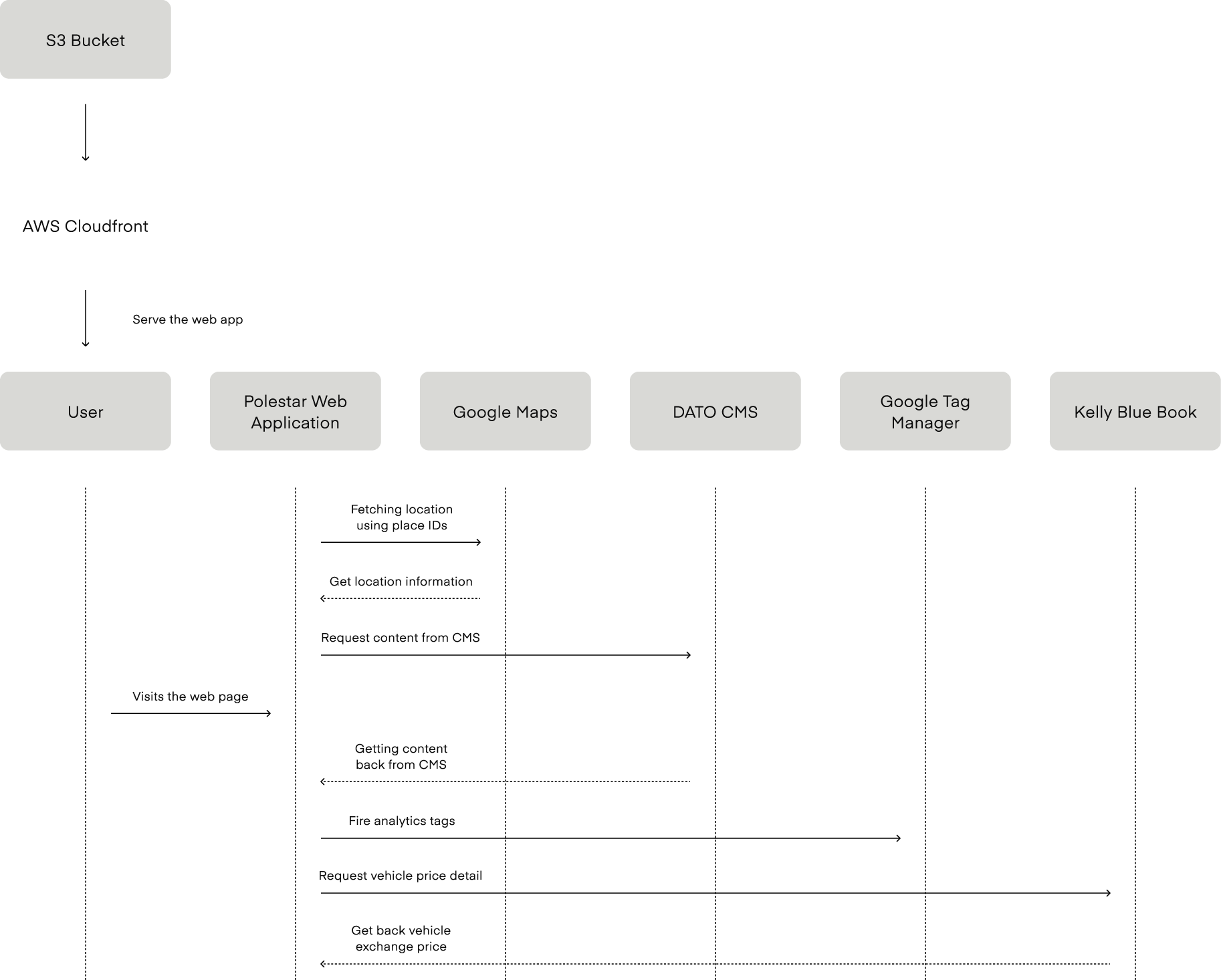
We used the tool browser stack to test our work on every device. We also ensured the videos were compressed in such a way that kept them low in size without sacrificing quality. The team meticulously tracked every repeated component within the designs and wrote code that could be reused. In some cases, this pushed the design team to get creative with reusable UI components, too. Since the website is deployed in a static (server-less) way, a pre-rendering solution was used to avoid any potential SEO implications. Object storage and CDNs are effective ways for development teams looking to deploy client-side rendered websites while keeping costs low and accelerating the delivery of assets.
3. The ability to A/B test
In order to test variations of the website, we had our engineering and product strategy leads collaborate to build path-based routing to separate the two versions we wanted to test.
We ultimately exceeded every KPI for Polestar:
+88% Time on site
+111% Session duration
–59% Bounce rate
+75% CTR to configurators
+190% Conversion (3X) in test drives booked
+162% Return visits
4. Scalable deployment
Each of Polestar’s physical locations had a page, or Space, and the North America Polestar team was rolling out new Spaces every other week. This meant our architecture needed to be sustainable in a way that didn’t require a deployment for each individual Space. We narrowed down on a decision to have complete control of these pages via a Content Management System (DatoCMS) and a single web template.
This gave complete flexibility to the Polestar digital team to roll out a new Space as often as they’d like in just a few clicks without having to depend on the engineering team. Components such as the URL, details, working hours, location on a map and current inventory can all be configured using the CMS, too. As a result, we have deployed more than 10 Spaces since April 2021.
This element of the work was a microcosm of the value our engineering team brought to the whole project — assimilating to Polestar's codebase and coding standards.
Behind the Build


Planning with Agile Scrum
We decided to use the popular agile scrum methodology to tackle Polestar's software project because there was parallel design, development and client feedback, all within a fast timeline. The YML team partnered with Polestar’s internal teams across product, UX, DevOps and SEO to ensure the experience aligned with Polestar’s standards, with custom tweaks here and there to optimize performance. We also handpicked experienced YML web developers with expertise in developing complex UI and transitions.
Collaboration Early and Often
We had regular sync ups with the design team and the Polestar product teams to ensure there was pixel perfect matching between the designs and the actual UI. Connecting early and consistently with the design team to discuss everything from standards to engineering feasibility to palette, formats and more helped us perform more efficiently. What came out at the end was absolutely the same as the design. There were quite a few dependencies, but they were identified a lot early in the process and all documentation was ready for the engineering team before the development started. Over-communication was the key as that helped everyone to be in sync all the times.
Engineering
We also planned to architect in such a way that every feature or UI element can be carved out with ease as a reusable component for other Polestar teams.
We indulged in research constantly to provide the best possible engineering solutions. All the spikes / research tickets were identified early so things were ready before the sprint began. There were also regular performance checks, security scans, and ADA compliance checks that were part of the QA process.
Start to finish, the team built and tested custom code, animations and transitions to create Polestar’s state-of-the-art product page that could scale and represent their iconic brand and flagship electric vehicle.
Take a deeper look at case study with Polestar here.
About the Author:
Shanky Munoth started his career as a mobile developer but later co-founded an EV-Mobility startup in 2015 and ran it for 5 years as a CTO before joining YML in a leadership role. Shanky has worked on multiple technologies such as mobile, web, backend, EV, IOT, embedded systems and devops. Shanky has worked on domains such as Banking, Fintech, Mobility, Automotive and retail e-commerce. He was also a part of the team that designed the pre-poll campaigning applications for US elections. His experience includes designing software systems that are stable, scalable, great looking and cost friendly. Shanky has built quite a few high performing teams from scratch. When he heard about an opportunity of redesigning the main digital space of polestar, he did not wait a second to ask for it due to his interest in EVs. The YML senior leadership was more than happy to give the opportunity to him.