
The Home Depot’s reign as most trusted home retailer in the U.S. was starting to get challenged by the competition. With their digital experience lagging behind their brand, our challenge was to arm The Home Depot with the ultimate power tool: a mobile-first, omni-channel experience and pickup / delivery service that puts control and convenience in customers' hands.
-
2xMobile sales doubled in a year (2016)
-
2019Forrester Retail Wave Best-in-Class for Mobile Retail
-
1The Best Omni-Channel Retail Experience (2017)
Agile design that scales
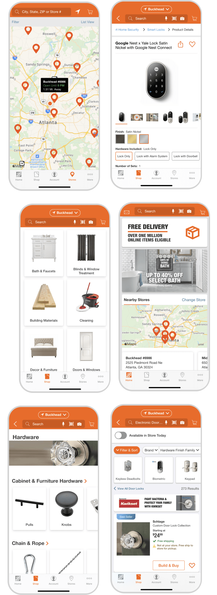
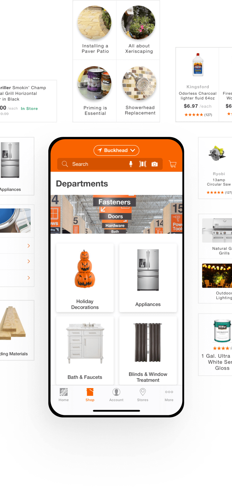
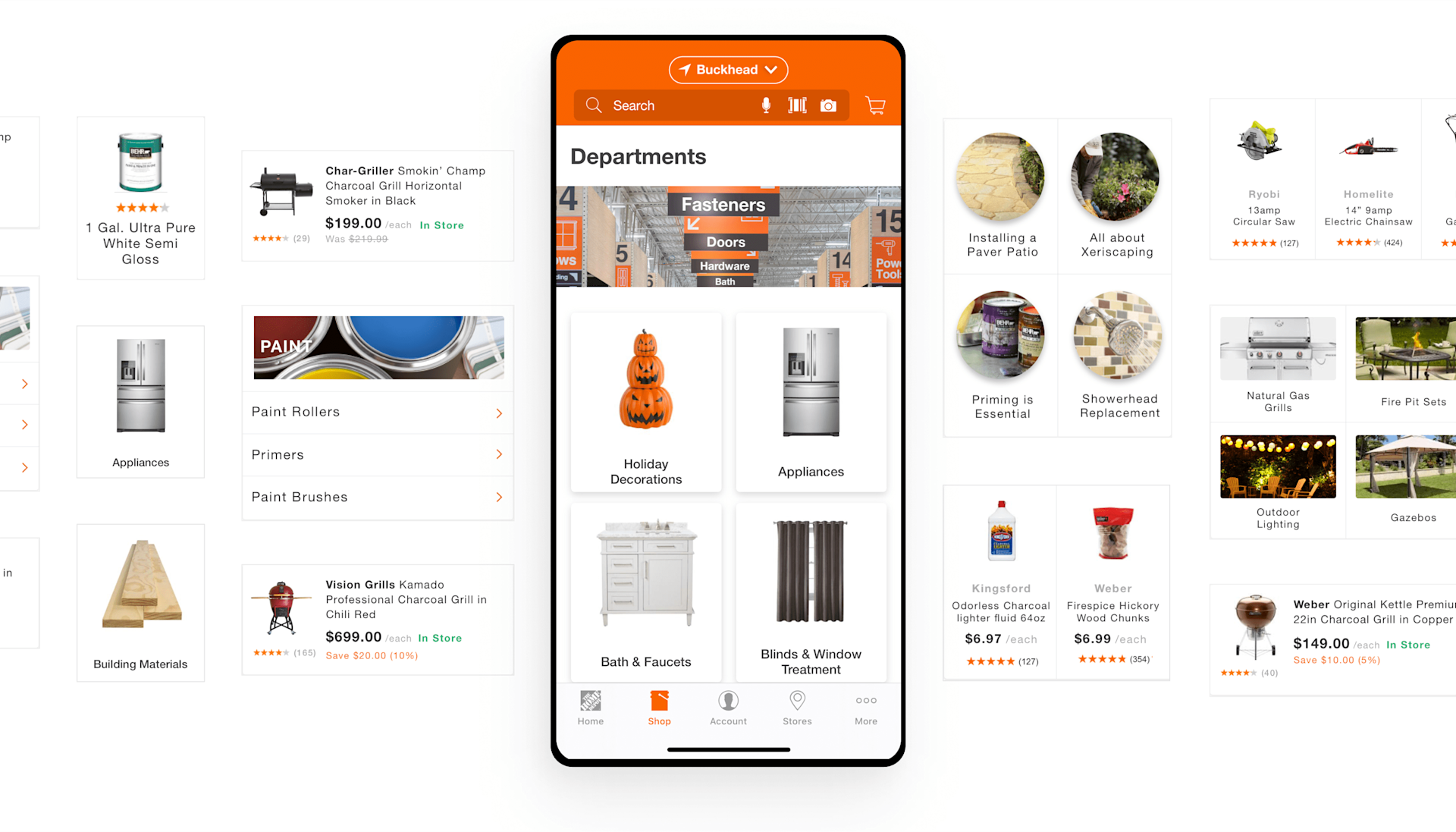
Imagine browsing a catalog of over a million items on the go. We needed to design for agility and scale. Using a card-based design system, we created a vast library of components that delivered a consistent experience on mobile, and on the web.
Details make the experience
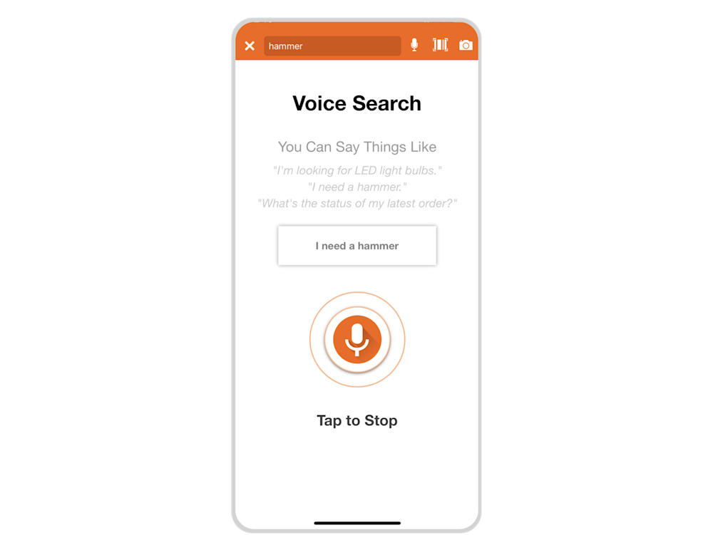
The new voice or image search feature allows users to browse products, check in-store availability and schedule pickup or delivery. Location services help in-store shoppers to locate items by aisle and bin and scan barcodes for product details.

Predict customer needs
Home Depot’s mobile experience is equipped with world-class usability thanks to its superior search and more. The retailer’s search provides product and category-specific recommendations, including predictive suggestions. This makes it significantly easier for consumers to find what they're looking for, and discover new products for unplanned purchases.
“It’s all about making the shopping experience easier & consistent across desktop, mobile, & in-store.”


How we did it
Strategy
- Brand and Product Strategy
- UX Strategy
- Research
- User Testing
Content
- Information Architecture
Design
- Art Direction
- Product Design
- Accessibility
- Motion Design
Engineering
- Proof of concept


